Table of content
You’re probably wondering why, despite seemingly positive optimization results in the form of increased traffic to your website, your sales aren’t anywhere near where you want them to be.
In all likelihood, it has something to do with your web design.
Web design does more than just make a website look good. It can also influence visitors to provide you leads and eventually, those much-desired conversions, which could come in the form of a filled contact form, a newsletter subscription, and of course, sales of your product or service.
So how can you tweak your web design in a way that will increase your chances of driving sales to your business? Here are some tips.
Shorten the contact form
Your contact form is your website’s primary lead generation tool. When it asks for too much information, it becomes a long one, and no one really likes or has the time filling in lengthy forms.
If possible, ask only for the names, email addresses, and zip codes of your visitors. With such a short contact form, users will be more likely to fill it out willingly.
Use a bit of color psychology

Put your call-to-action (CTA) button somewhere prominent
It’s your CTA or call-to-action button that people have to click if they’re thinking about giving you that conversion you want. If you can put it in a prominent place on your website, then that would be great. No sense convincing them the whole time only for them to miss that CTA when they finally decide to act on it in your favor.
Make it easy to navigate
Most people get turned off and give up exploring a website when they’re finding it hard to navigate. You would do well to make all navigation elements clickable, divide categories clearly, and put in a working search feature to make navigation easier. While you’re at it, put all the most information above the fold so they won’t have to scroll down to find what they want.
Put up videos
If content is king, then video is the current king of content. Videos are so popular these days, and by 2022, they’re expected to make up 82% of all web traffic. Product videos can boost conversions and sales, so incorporate them into your web design when you can. Just make sure that they aren’t too long. A video about three to four minutes long would be great.
Go for a mobile-friendly web design

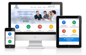
Responsive web design is the way to go if you want a website that displays well on all screen sizes. Considering how most mobile users use their devices for shopping, you’re likely to get a piece of that action when your website is mobile-friendly.
Your web design can help you drive sales to your business. The tips above may just be some of the ways you can tweak your web design to help you in that regard, but they’re enough to get you started.


